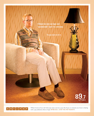
The similar visual style of each scene and the "Anti-Pop" theme provide cohesion across all three pieces. The brief copy blurbs each tell a different story but their font, placement, and length are uniform.
These ads have been around for a few years, and although the richness of the color always draws my eye, I've never really understood the concept. I always assumed there was just something I didn't understand about it, but now I'm pretty sure it simply doesn't make much sense. I get that it's supposed to mirror the "My Anti-Drug" PSAs ... but I don't follow the vintage/retro scene-setting. The images aren't pop, nor do they really represent WTMD's voice or audience (anti-pop). The copy works, but to me, the visual theme creates some conflict.
I tracked down the brief from the agency that worked on this campaign. It doesn't really help clarify things either:
Think pop music is harmless? Don’t be fooled, friend. Pop music can make you do things you wouldn’t normally do, act in ways you wouldn’t normally act, wear things you wouldn’t normally wear. It gets under your skin and before you know it, you’re a superficial shell of the person you once were.AntiPop is Planit’s “public service” campaign designed to bring "real life" pop music tragedies to the surface for all the world to see. AntiPop is a sobering reminder of what thin, shallow, cookie-cutter pop music can do to perfectly normal people.
So is it a cohesive campaign? Absolutely. Is it a good campaign? Ehh...


No comments:
Post a Comment