Thursday, December 16, 2010

About Face

There's been a lot of typography talk among the 601 crew this week. All of these posts got me thinking about my own type choices this semester. Maybe the feeling is premature (I haven't taken Typography yet), but I think my experience in 601 has helped reduce my fear of typography from "absolutely terrified" to "moderately overwhelmed." The number of times that Amy told me I chose a good typeface was slightly higher than the number of times she told me my "type choice was all wrong." Small victories.

Like staring directly into the sun.

Just like everyone else in the class, I scoured the Internet looking for some kind of a "when and where" usage guide for type. But I found that no such thing really exists-- or at least not in any way that's useful. I think we've just gotta get out there and learn by doing.

Of course, I don't purport to know what I'm doing at all. I'm by no means an expert (in fact, this post might just prove that I'm a complete hack), but here's what I've learned that might help:
  • Know the history and tradition of common typefaces. History often informs our response to a typeface. Knowledge of the style, tradition, and time period of a font's development can help us make better choices. For example, if you're going for a Western theme, don't make a headlong dash for Rosewood and call it a day. Instead, explore typefaces of the age, such as Clarendon , which was was originally developed in the 1840s and works well as an Old West or Victorian-era font. 
  • If you see a typeface you like, identify it. Talk to a designer, go to WhatTheFont -- whatever you need to do to track it down. The funny thing is that once you learn what the font is, and take the time to study its style, you'll start seeing it all over the place. There are 100,000 fonts out there, but you'll notice that the same few families are incredibly common.
  • When starting a project, identify some key words about the style you envision. Then seek a face that embodies those characteristics. A typeface is to print as a soundtrack is to a movie; it tells us how to feel. The subject for my campaign project, for example, was fair teacher compensation. I wanted my piece to reflect a teacher's personality: authoritative yet approachable. I found the authority in a slab serif (when looking at a slab, you can almost feel the assertive knock of metal type). Unfortunately many slabs, such as Rockwell, were too cumbersome. Then I discovered the semi-slab Museo while thumbing through a Dell ad. Museo's partial serifs are understated and smooth. So it shares some of a slab's power, especially in bold, but balanced with an inviting flow.
  • Even if a typeface is supposed to work in a certain situation, don't shoehorn it in. I chose Garamond for my two-page magazine layout because I read that it's a good choice for legibility, plus there's that old saying that serifs help guide the eye in body copy. This is one of my font choices that Amy said was completely wrong. My target publication was Popular Science, and she commented that Garamond was far too formal and uptight. A sans-serif would have served me much better.
  • Complete font families make life much easier. I read on the Hoefler and Frere-Jones blog that free fonts are great for design students because they come in limited styles, which forces us to do more with less. This is probably true -- an artist with limited tools must rely on his or her ingenuity. But I say to hell with that. A professionally designed family often comes in a half-dozen weights, plus italics, maybe even a condensed version for use when space is an issue. When we're given that much control over type, our tools are no longer the limiting factor. (Our creativity might be ... but that's a topic for another blog. And another class.)
So what do you guys say? We've all suffered some typographical losses this year, but I think we've each had some victories too. Does anyone have any other type advice from the front lines of 601?

Wednesday, December 15, 2010

Infotragic

The semester's almost over, and the pressure is on. I need all the help I can get, so my girlfriend offered up some assistance with my infographic.  Here's what she came up with.


Who knew that Word could be such a powerful design tool?

Tuesday, December 14, 2010

Blood work of art

For me, the hardest part of a blood test isn't the test itself. Nor is it the overnight fast, the rush-hour crawl to the lab, or even the inevitable delay in the lab's waiting room.

The hardest part -- by far -- is making sense of the results. The medical jargon, the acronyms, the abstract numerical values ... And to make matters worse, they always seem to be printed on a mid-80s dot matrix printer in desperate need of a new ribbon.

It seems that the editors of Wired feel the same way, because this month's issue features an 8-page spread in which common lab reports are re-imagined by professional designers. Wired addresses three reports, evaluates the information design of each, and suggests a solution that's much easier to make sense of.

An example is below (original lab work on left, redesign on right).  Check out Wired for the full article online.

Click to embiggen.


Saturday, December 11, 2010

Getting there, Google style

There's a great post at 41Latitude (by way of Chartporn) that looks at all of the little tricks Google employs to make its maps more legible than competitors like Bing and Yahoo.

I use Google Maps exclusively. I never really considered it until now, but I think most of my allegiance comes Google's superior visual style. (I also find Google's point-to-point directions to be slightly better that others, but it's a pretty negligible difference.)

The article points to things like color choice, typographic hierarchy, and stroke width as contributors to Google's visual experience.

Check out the article for tons of examples. It's stuff we should in keep in mind for our infographics -- or any other project that comes our way.

Friday, December 3, 2010

But I already did this one (Show and Tell)

This week's show and tell is a video that has some interesting aspect to it. My all-time favorite video is actually one I've already featured here in a previous post -- Western Spaghetti by PES, a simply fantastic piece of stop motion.

Linking to a previous post is a pretty fantastic cheap way of going about this show-and-tell thing.  So, for your viewing pleasure, I present another video by PES that's in the same spirit of Western Spaghetti. Just much, much shorter.

See everyone in ... about 9 hours.


Wednesday, December 1, 2010

Thank you, Constance Hale

This week at work, I was assigned a new article for the Towson alumni magazine. The publication has a pretty big distribution -- about 100,000 -- and writing for an audience that broad ain't easy. I really have to be on my game when I write these pieces.

But this week I wasn't on my game. At all.

My subject was interesting -- a former undercover agent with the FBI who had tons of great cloak-and-dagger stories. It had the potential to be a great article. But I just couldn't pull it together. It wasn't terrible. It also wasn't great. Tepid would be an apt description.

So, channeling Sin and Syntax I tore into that sucker and underlined every place I found some form of the snore-inducing "to be."  Then I replaced as many of them as I could with more engaging words.

It worked really well. Now my article's loaded with the action befitting an undercover agent. And I don't have to switch careers. (So, bonus.)

Just something to keep in mind the next time you hit a writing roadblock.

Sunday, November 21, 2010

Packaging Comptacular

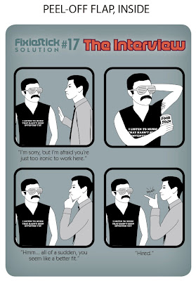
Since I missed class this last week, here's the design for my packaging project.  My original project is deodorant, re-imagined as FixieStick -- The social camouflage for hipsters. The packaging itself is quite simple.  Just a front label, back label, and an additional double-sided removable label that goes over top of the back label to reveal drug facts (that panel is rather boring, but S+A decided I should include it since this would be applied to one's body.)

Thoughts?