Thursday, December 16, 2010

About Face

There's been a lot of typography talk among the 601 crew this week. All of these posts got me thinking about my own type choices this semester. Maybe the feeling is premature (I haven't taken Typography yet), but I think my experience in 601 has helped reduce my fear of typography from "absolutely terrified" to "moderately overwhelmed." The number of times that Amy told me I chose a good typeface was slightly higher than the number of times she told me my "type choice was all wrong." Small victories.

Like staring directly into the sun.

Just like everyone else in the class, I scoured the Internet looking for some kind of a "when and where" usage guide for type. But I found that no such thing really exists-- or at least not in any way that's useful. I think we've just gotta get out there and learn by doing.

Of course, I don't purport to know what I'm doing at all. I'm by no means an expert (in fact, this post might just prove that I'm a complete hack), but here's what I've learned that might help:
  • Know the history and tradition of common typefaces. History often informs our response to a typeface. Knowledge of the style, tradition, and time period of a font's development can help us make better choices. For example, if you're going for a Western theme, don't make a headlong dash for Rosewood and call it a day. Instead, explore typefaces of the age, such as Clarendon , which was was originally developed in the 1840s and works well as an Old West or Victorian-era font. 
  • If you see a typeface you like, identify it. Talk to a designer, go to WhatTheFont -- whatever you need to do to track it down. The funny thing is that once you learn what the font is, and take the time to study its style, you'll start seeing it all over the place. There are 100,000 fonts out there, but you'll notice that the same few families are incredibly common.
  • When starting a project, identify some key words about the style you envision. Then seek a face that embodies those characteristics. A typeface is to print as a soundtrack is to a movie; it tells us how to feel. The subject for my campaign project, for example, was fair teacher compensation. I wanted my piece to reflect a teacher's personality: authoritative yet approachable. I found the authority in a slab serif (when looking at a slab, you can almost feel the assertive knock of metal type). Unfortunately many slabs, such as Rockwell, were too cumbersome. Then I discovered the semi-slab Museo while thumbing through a Dell ad. Museo's partial serifs are understated and smooth. So it shares some of a slab's power, especially in bold, but balanced with an inviting flow.
  • Even if a typeface is supposed to work in a certain situation, don't shoehorn it in. I chose Garamond for my two-page magazine layout because I read that it's a good choice for legibility, plus there's that old saying that serifs help guide the eye in body copy. This is one of my font choices that Amy said was completely wrong. My target publication was Popular Science, and she commented that Garamond was far too formal and uptight. A sans-serif would have served me much better.
  • Complete font families make life much easier. I read on the Hoefler and Frere-Jones blog that free fonts are great for design students because they come in limited styles, which forces us to do more with less. This is probably true -- an artist with limited tools must rely on his or her ingenuity. But I say to hell with that. A professionally designed family often comes in a half-dozen weights, plus italics, maybe even a condensed version for use when space is an issue. When we're given that much control over type, our tools are no longer the limiting factor. (Our creativity might be ... but that's a topic for another blog. And another class.)
So what do you guys say? We've all suffered some typographical losses this year, but I think we've each had some victories too. Does anyone have any other type advice from the front lines of 601?

Wednesday, December 15, 2010

Infotragic

The semester's almost over, and the pressure is on. I need all the help I can get, so my girlfriend offered up some assistance with my infographic.  Here's what she came up with.


Who knew that Word could be such a powerful design tool?

Tuesday, December 14, 2010

Blood work of art

For me, the hardest part of a blood test isn't the test itself. Nor is it the overnight fast, the rush-hour crawl to the lab, or even the inevitable delay in the lab's waiting room.

The hardest part -- by far -- is making sense of the results. The medical jargon, the acronyms, the abstract numerical values ... And to make matters worse, they always seem to be printed on a mid-80s dot matrix printer in desperate need of a new ribbon.

It seems that the editors of Wired feel the same way, because this month's issue features an 8-page spread in which common lab reports are re-imagined by professional designers. Wired addresses three reports, evaluates the information design of each, and suggests a solution that's much easier to make sense of.

An example is below (original lab work on left, redesign on right).  Check out Wired for the full article online.

Click to embiggen.


Saturday, December 11, 2010

Getting there, Google style

There's a great post at 41Latitude (by way of Chartporn) that looks at all of the little tricks Google employs to make its maps more legible than competitors like Bing and Yahoo.

I use Google Maps exclusively. I never really considered it until now, but I think most of my allegiance comes Google's superior visual style. (I also find Google's point-to-point directions to be slightly better that others, but it's a pretty negligible difference.)

The article points to things like color choice, typographic hierarchy, and stroke width as contributors to Google's visual experience.

Check out the article for tons of examples. It's stuff we should in keep in mind for our infographics -- or any other project that comes our way.

Friday, December 3, 2010

But I already did this one (Show and Tell)

This week's show and tell is a video that has some interesting aspect to it. My all-time favorite video is actually one I've already featured here in a previous post -- Western Spaghetti by PES, a simply fantastic piece of stop motion.

Linking to a previous post is a pretty fantastic cheap way of going about this show-and-tell thing.  So, for your viewing pleasure, I present another video by PES that's in the same spirit of Western Spaghetti. Just much, much shorter.

See everyone in ... about 9 hours.


Wednesday, December 1, 2010

Thank you, Constance Hale

This week at work, I was assigned a new article for the Towson alumni magazine. The publication has a pretty big distribution -- about 100,000 -- and writing for an audience that broad ain't easy. I really have to be on my game when I write these pieces.

But this week I wasn't on my game. At all.

My subject was interesting -- a former undercover agent with the FBI who had tons of great cloak-and-dagger stories. It had the potential to be a great article. But I just couldn't pull it together. It wasn't terrible. It also wasn't great. Tepid would be an apt description.

So, channeling Sin and Syntax I tore into that sucker and underlined every place I found some form of the snore-inducing "to be."  Then I replaced as many of them as I could with more engaging words.

It worked really well. Now my article's loaded with the action befitting an undercover agent. And I don't have to switch careers. (So, bonus.)

Just something to keep in mind the next time you hit a writing roadblock.

Sunday, November 21, 2010

Packaging Comptacular

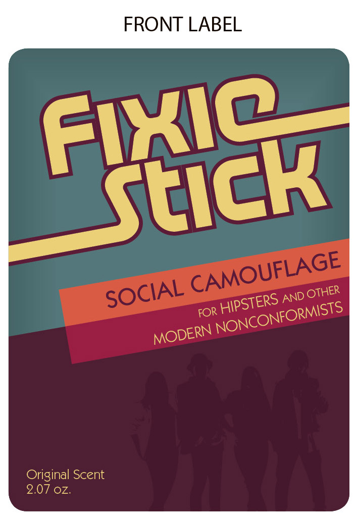
Since I missed class this last week, here's the design for my packaging project.  My original project is deodorant, re-imagined as FixieStick -- The social camouflage for hipsters. The packaging itself is quite simple.  Just a front label, back label, and an additional double-sided removable label that goes over top of the back label to reveal drug facts (that panel is rather boring, but S+A decided I should include it since this would be applied to one's body.)

Thoughts?


Thursday, November 18, 2010

Information Overload (Show and Tell)

My example of a bad infographic certainly isn't terrible, and it probably does as much right as it does wrong. It shows corporate bankruptcies in recent history, and uses sinking ships to represent failed firms. The bigger the ship, the bigger the failure, and the ships are even color coded by industry (that's the part I like). But here's the problem: The ships themselves are really just window dressing for data that could be easily explained in a simple bar graph.  There's an entire chart included at the bottom that correlates the type of ship (dinghy, tug, yacht, etc.) with the size of the failure -- but this is completely uneccessary because that very information is already written numerically on the chart.  The variation in boat types might add visual interest, but it's a mistake to attempt to force correlation with data that's already clearly laid out.


Here's my example of a good infographic, which I dug up at www.infosthetics.com but originally came from Wired. It's a visual representation of the 311 calls received in New York over a period of 24 hours.  Interesting subject, and quite easy to understand once you become oriented to the layout.


It is Thursday.

Yawn. Anybody else not really feeling this whole Thursday morning thing? You're in luck -- me neither.

Take a minute to check out Unhappy Hipsters. The blog pulls the somewhat stark photos from design and architecture publications like Dwell and ArchDaily, and recasts them with whip-smart captions that highlight the austere silliness of the whole scene. The writing is fantastic. And there are about 200 posts to wade through -- perfect for the Thursday morning doldrums.


Caption via UnhappyHipsters:
Neither wanted to be the one to admit that the parallel fireside bench had been a mistake—or that the linear peephole actually obstructed the view.

Brilliant. Although, for the record, I think the name of the site is misleading -- Unhappy Yuppies seems more accurate, but I dunno... maybe hipster is the new yuppie. These terms don't exactly have discrete definitions.

Friday, November 12, 2010

Coffee Talk (Show and Tell)

Considering how many Starbucks cups are carried into Room 309 every Saturday, I couldn't pass this up.

A few years ago, Starbucks started printing little nuggets of crowdsourced wisdom on their coffee cups, as part of their "The Way I See It" campaign.  They welcomed (and continue to receive) submissions from authors, entertainers, social leaders and plenty of regular ol' caffeine fiends. Some -- though not all -- of these saccharine little quotes tell a brief story or share some lesson.


And interestingly, while the outward narrative is what appears on each cup, Starbucks is also weaving its own corporate tale between the lines. The Starbucks website describes the campaign as "continuing the tradition of the coffee house as a place of conversation, ideas, and enlightenment."  By printing these cups with their customers' own stories, they're really selling the idea that Starbucks is about more than just coffee, without directly saying so.

Tuesday, November 9, 2010

Brand new

I think Pepsi must have an entire division assigned to re-branding fails. We can't forget the Tropicana disaster from last year (although, to be fair, the first time I saw that carton on the shelf, I rather liked it.) but more recently, Pepsi rebranded another of its flagship products: Gatorade.

Once upon a time, there was Gatorade. Just Gatorade. Then, came the low-calorie variants, which were branded G2. So we had Gatorade and G2. OK, nothing too confusing there. But oh wait, here come three more products: Gatorade Rain, Gatorade Fierce, and Gatorade X-Factor. Uh-oh.

And here begins Pepsi's two-year spiral into marketing madness. Determining (rightfully so) that their product line was a little convoluted, the good people at Pepsi decided it was re-brand time. So, Gatorade Rain became Gatorade No Excuses. Gatorade X-Factor became Gatorade Be Tough. Gatorade Fierce Became Gatorade Bring It.  Simple and logica -- wait, what?

Hmm... still confusing. So in 2010, ANOTHER rebrand. The answer to this mess? The G Series. Now, every kind of Gatorade has a number, which indicates the drink's level of performance. So we've got a G Series 01, G Series 02, and G Series 03. We've also got G Pro 01, G Pro 02, and G Pro 03.  And for the calorie conscious, there's a G2-branded low calorie option, within the 02 level of the G series.  So... I guess that makes it G Series 02 G2?

The whole mess is summed up quite nicely in this article at Daily Finance: Gatorade's Rebranding: So Confusing It Requires an Ad to Explain It. Stay tuned here, because one day this week I intend to create a handy little graphic to help simplify this mess. Just as soon as I figure it out myself.


Thursday, November 4, 2010

A Shining Example (Show and Tell)

Since this week's show and tell got all blogified, I figured I'd share some video for my example of narrative. This is a spoof trailer for the movie The Shining. All the footage is from the original, but it's been recut and given a new soundtrack and voiceover. It's amazing how those changes can recast the tone the entire film.

There are probably better examples of a narrative out there (for example, any book, ever), but I thought this was a good example of how a known narrative can be transformed into something completely different.

Monday, November 1, 2010

Stop-motion Monday

Since we're all crunching away on our storyboards this week, I thought I'd post a little inspiration.

"Western Spaghetti" made the rounds on YouTube a few years ago, and it's still the coolest stop-motion piece I've ever seen. Pin cushions and Rubik's Cubes never looked so delicious.


The visuals are pretty stunning, but I think it's the audio that sells it. The viewer hears all of the familiar sounds of cooking -- knives chopping, oil sizzling, water sloshing -- and the animation becomes much more believable. Watch it once with the sound off to see what I mean ... it still looks cool, but the real-life audio makes everything much richer.

Sunday, October 31, 2010

Tale as Old as Time (Show and Tell)

This week's show and tell was a group project. It's an epic narrative told entirely in paper and paste. Prepare to get your socks rocked.


Friday, October 29, 2010

Sense and ... Sensibleness?

The editors among us might appreciate this piece that aired on NPR yesterday. New evidence suggests that English novelist Jane Austen—long praised for her meticulously polished style—might not have acted alone.  It seems she owes some of her success to a very attentive editor who spit-shined her prose to its signature cordovan gleam.

From the story:

The beloved novelist—author of Sense and Sensibility, Pride and Prejudice, Mansfield Park and Emma—is known for her polished prose, her careful phrasing and her precise grammar. "Everything came finished from her pen," Austen's brother, Henry, said in 1818, a year after his sister's death

But now—though it may pain die-hard Austen fans—it turns out that Austen may have simply had a very good editor. Kathryn Sutherland, a professor at Oxford University, has been studying more than 1,000 original handwritten pages of Austen's prose. She's found some telling differences between the handwritten pages and Austen's finished works—including terrible spelling, grammatical errors and poor (often nonexistent) punctuation.

Original Austen manuscript. Not pictured: An editor, softly weeping.


Editing can be a pretty transparent trade. Two hundred years seems like a long time, but I think I speak for the editors everywhere when I say we should all be so lucky.

(While I'm on the subject of Austen, and in the spirit of Halloween ... has anyone read Pride and Prejudice and Zombies?)


Wednesday, October 27, 2010

Quality control

Apple just announced that the white version of the iPhone4 has been delayed -- again. For those those who haven't been following along at home, Apple's newest iPhone was supposed to be available in both black and white at launch, but the white still hasn't seen the light of day. It's widely believed that the problem lies with inconsistency in the white paint that Apple has attempted to use on the iPhone4. The brightness of the white varies from device to device, and therefore, it won't pass Apple's QC.


Say what you will about Apple -- but you've got to hand it to them for valuing the visual design of their products. From the painted glass back of the iPhone to the solid aluminum of the Macbook, Apple puts great care into aesthetics. It's even gotten them into trouble at times, what with the iPhone4's external antenna debacle and all. But it's still refreshing for a tech developer to so tightly control their visual identity trough the design of their products.

Sweating the small stuff

In his 2001 article "Typecasting," type designer Mark Simonson picked nit with the type choices in many period movies. It seems that anachronistic type runs rampant in Hollywood, and Simonson needed the world to know.

Simonson's original article is a decade old, but he occasionally posts more recent examples of out-of-place typography in his Son of Typecasting series. A 2008 article included a pretty thorough review of the type and signage used in AMC's Mad Men. His take-away message is that, on the whole, the sets and scenes of Mad Men are pretty solid but they could do better with their typography.

It's critical that designers know the heritage of the typefaces they select, and I understand that the typophiles out there want to see period-accurate fonts. Even I cringe when Zapfino is passed off as '60s hand-lettering. But how far do designers really need to go? Is it a big deal that Mad Men uses the ITC version of Kabel from 1975, rather than the original Kabel from 1927? Sure, an expert could tell the subtle differences, but the two are pretty dang similar.  The ITC version, by my eye, doesn't really seem all that out of place.


ITC Kabel in Mad Men: The worst thing ever?
But what do you guys think? When creating a period piece, should typefaces be kept true to their time period? Or is there some wiggle room?


Monday, October 25, 2010

Word Play (Show and Tell)

I had a little bit of trouble assembling a list of my favorite words. With a quarter million to choose from, picking favorites is a tall order.

But, here are a few. Some I chose for their meaning or connotation. Others I chose for the way they sound.

donnybrook
malarkey
maudlin
interlocuter
iconoclast
fetid
trollop
twang

Tuesday, October 19, 2010

Comic Bans

For anyone using Safari 5, there's a new third-party extension that will automatically change Comic Sans to Helvetica on any website you visit. And if that doesn't go far enough, it'll also wipe out Arial for you.

One caveat: The presence of Comic Sans usually signals content not worth reading in the first place. Kind of like how bright colors signal danger in nature. Comic Sans is nature's way of telling us to stay away. Eliminate Comic Sans, and you've eliminated a crucial warning sign of crappy content. So, proceed with caution.

Sunday, October 17, 2010

Get to Work! (Show and Tell)

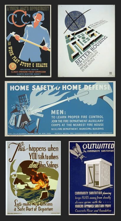
For this week's show and tell -- an example of a call to action -- I dug into a fantastic archive of Works Progress Administration posters maintained by the Library of Congress. The WPA was a New Deal-era agency that put millions to work on public works projects, and advocated social wellness and welfare. They're great examples of the words and images of the '30s and '40s. I included a few of the posters below, but the LOC site has over 900 on display. If you've got some time, swing on by. Very cool.


Hundreds and hundreds more are here: www.loc.gov/pictures/collection/wpapos/search/?co=wpapos&sp=1&st=slideshow