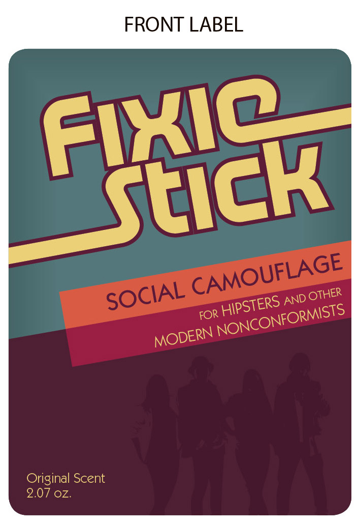
Since I missed class this last week, here's the design for my packaging project. My original project is deodorant, re-imagined as FixieStick -- The social camouflage for hipsters. The packaging itself is quite simple. Just a front label, back label, and an additional double-sided removable label that goes over top of the back label to reveal drug facts (that panel is rather boring, but S+A decided I should include it since this would be applied to one's body.)
Thoughts?


Thanks for making me realize how bad mine was.
ReplyDeleteOnce again, I am reminded that I'm not a designer in any way, nor am I better than mediocre in this class. Awesome.
ReplyDeleteIt looks great, best in the class by far.
Aw man, I'm so sorry I didn't see this until today! It definitely looks very hipster (the weird seventies-type colors work well) and I really like that you have a peel off sticker on the back like real deodorant! The cartoon is hilarious as well--the only thing I would change is the color of the ingredients list and whatnot-maybe use the yellow from your back label? The white is just too...I dunno, just too much. I love it though, good job!
ReplyDeleteThis is great! Love the illustration (The Interview) ... so fun. Nice work!
ReplyDelete