I was thumbing through an old issue of Wired and came across an interesting article on the mutability of e-books.
I'm not on the e-book bandwagon just yet. To be honest, I'm barely on the p-book bandwagon -- I probably average about three books a year. (I like to say that it's because I'm an editor and I read enough for my day job, but I think it's really just laziness.)
When I do read for entertainment, nothing can diminish my experience more than lousy proofreading. Sure, any first edition is going to have a typo or two. But sometimes the errors are so egregious and many, especially in books with a niche audience, that the whole thing is kinda ruined or me.
But with e-books, such errors can be fixed immediately by the publisher, with a new version available for download the same day. Gone is the time first and second editions. Now it's more like editions 1.0 and 1.1.
The Wired article also points out the slippery-slope nature of on-demand edits. What's to stop an author from retconning his work if he comes up with a better ending six months down the line? There's something definitive about an ink-and-paper edition that's lost in digitization. But such philosophical questions aside, if e-books allow me to read a first edition without fear of the copyeditor cringe, I'm all for 'em.

Friday, October 15, 2010

Thursday, October 14, 2010
Campaign contribution (Show and Tell)
These examples of campaign are from WTMD, the public radio station out of Towson whose tagline is "Radio for Music People."
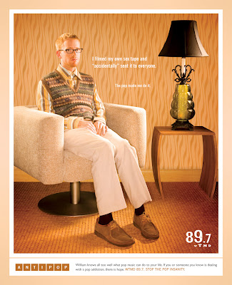


The similar visual style of each scene and the "Anti-Pop" theme provide cohesion across all three pieces. The brief copy blurbs each tell a different story but their font, placement, and length are uniform.


These ads have been around for a few years, and although the richness of the color always draws my eye, I've never really understood the concept. I always assumed there was just something I didn't understand about it, but now I'm pretty sure it simply doesn't make much sense. I get that it's supposed to mirror the "My Anti-Drug" PSAs ... but I don't follow the vintage/retro scene-setting. The images aren't pop, nor do they really represent WTMD's voice or audience (anti-pop). The copy works, but to me, the visual theme creates some conflict.
I tracked down the brief from the agency that worked on this campaign. It doesn't really help clarify things either:
Think pop music is harmless? Don’t be fooled, friend. Pop music can make you do things you wouldn’t normally do, act in ways you wouldn’t normally act, wear things you wouldn’t normally wear. It gets under your skin and before you know it, you’re a superficial shell of the person you once were.AntiPop is Planit’s “public service” campaign designed to bring "real life" pop music tragedies to the surface for all the world to see. AntiPop is a sobering reminder of what thin, shallow, cookie-cutter pop music can do to perfectly normal people.
So is it a cohesive campaign? Absolutely. Is it a good campaign? Ehh...
Tuesday, October 12, 2010
S.O.S.
I'm an editor at a state university. That means that most of the writing that crosses my desk has been authored by academics, bureaucrats or undergraduates. It's like the Bermuda Triangle of Official Style. So I figured I'd take some time to share a few gems of inflated writing that have crossed my desk today:
It's going to be a long day.
- "The deadline to submit the Academic Interest Form for the fall 2011 term is Nov. 1. Failure on behalf of the student to submit this form by the aforementioned deadline will result in an inability to enroll in classes at the University."
- "Fall and spring tuition bill payments submitted via credit card will be processed by NelNet, the University's third-party contractual business partner. Any inquiries about credit card payments should filed directly with this third-party partner."
- "Suicide is the second-leading cause of death among college students in the United States. If you are currently struggling with depression and/or suicidal thoughts, or if you know someone who is struggling with depression and/or suicidal thoughts, contact the Counseling Center immediately."
It's going to be a long day.
Friday, October 8, 2010
Point of Conception (Show and Tell)
I grabbed the low hanging fruit this week and decided to raid the archive at work for an example of concept. I did, at least, have this specific piece in mind when I set out on my search. So it's not like I simply took a haphazard tumble through some old boxes at 4 p.m. on a Friday, desperately searching for anything. Rather, I took a haphazard tumble through some old boxes at 4 p.m. on a Friday, desperately searching for something.
In any event, I did find what I was looking for. It's an appeal for our annual giving campaign. Annual giving traditionally sees smaller donations, and our development office wanted to stress the importance of gifts at any size. So, the tagline is "The biggest gifts come in small packages," and the inside features photos of staff, faculty, and alumni babies doing all manner of cute shit. The copy is a narrative about parents helping children grow, just as donors can help the university grow. It's all quite clever and well designed.
By the way, I'd love to take credit for the concept on this one, but it's all the work of a designer and my former boss. This was conceived (get it?) four years ago while I was still pretty new to the shop. But hey, at least I got to help proofread it. (Thrilling.)
Cover and inside page:


In any event, I did find what I was looking for. It's an appeal for our annual giving campaign. Annual giving traditionally sees smaller donations, and our development office wanted to stress the importance of gifts at any size. So, the tagline is "The biggest gifts come in small packages," and the inside features photos of staff, faculty, and alumni babies doing all manner of cute shit. The copy is a narrative about parents helping children grow, just as donors can help the university grow. It's all quite clever and well designed.
By the way, I'd love to take credit for the concept on this one, but it's all the work of a designer and my former boss. This was conceived (get it?) four years ago while I was still pretty new to the shop. But hey, at least I got to help proofread it. (Thrilling.)
Cover and inside page:


Thursday, October 7, 2010
Digitalchemy, now with 50% more pop
This little gem popped up on The Oatmeal recently. It's called, "How a Web Design Goes Straight to Hell" but in this case, "web design" could easily be substituted for graphic design or writing.
There's a line in there about a client asking for a web design to "pop" and be "edgier." Story of my life. I don't do design work professionally, but I do tons of writing and I collaborate with designers often. We get buzz words like this in creative briefs all the time. I was once asked to write a 10-page portfolio that was "YouTubian." Three drafts later I discovered that the client actually wanted the language to be youthful, snappy, humorous, and a bit tongue-in-cheek. That, I can do. "YouTubian" left me guessing.
But I don't really blame the client. As creatives we sometimes forget that we use a slightly different vocabulary than our clients. It's up to us to translate and decode. Sure, we shouldn't HAVE to, and in a perfect world we wouldn't. But without clients (or some client-like entity that cuts our paychecks), we'd be on the street. That'll never change. They'll never change. So it's up to us to bridge the gap.
There's a line in there about a client asking for a web design to "pop" and be "edgier." Story of my life. I don't do design work professionally, but I do tons of writing and I collaborate with designers often. We get buzz words like this in creative briefs all the time. I was once asked to write a 10-page portfolio that was "YouTubian." Three drafts later I discovered that the client actually wanted the language to be youthful, snappy, humorous, and a bit tongue-in-cheek. That, I can do. "YouTubian" left me guessing.
But I don't really blame the client. As creatives we sometimes forget that we use a slightly different vocabulary than our clients. It's up to us to translate and decode. Sure, we shouldn't HAVE to, and in a perfect world we wouldn't. But without clients (or some client-like entity that cuts our paychecks), we'd be on the street. That'll never change. They'll never change. So it's up to us to bridge the gap.
Friday, October 1, 2010
Typeblography
In keeping with the typography theme that I set with today's earlier post...
It seems that the Hoefler and Frere-Jones foundry has released a new type family. (And by "new," I mean "it was posted to their website two months ago, but it's new to me.") Forza is a square sans-serif that, according to H&FJ's website, was commissioned by Wired for their redesign. Coincidentally, while I was thumbing through Wired for last week's show and tell, I spent a while trying to figure out what font they were using. No luck with that until today.
H&FJ calls the font "articulate and assertive." I'm glad they're helping me out with the description here because I don't yet know enough about typography to describe it in such terms. But it is very attractive, especially as a display font, and in regular H&FJ style it's available in a bunch of sizes and weights.
I'd love to pick this up. If only had a few hundred dollars to burn...
It seems that the Hoefler and Frere-Jones foundry has released a new type family. (And by "new," I mean "it was posted to their website two months ago, but it's new to me.") Forza is a square sans-serif that, according to H&FJ's website, was commissioned by Wired for their redesign. Coincidentally, while I was thumbing through Wired for last week's show and tell, I spent a while trying to figure out what font they were using. No luck with that until today.
H&FJ calls the font "articulate and assertive." I'm glad they're helping me out with the description here because I don't yet know enough about typography to describe it in such terms. But it is very attractive, especially as a display font, and in regular H&FJ style it's available in a bunch of sizes and weights.
I'd love to pick this up. If only had a few hundred dollars to burn...
The science of type
In college, I could always pick out the science nerds in the dorm. They were the ones with the periodic table of elements tacked on their wall.
Now in grad school, I have a periodic table of my own. Guess I can't hide what I really am.

Now in grad school, I have a periodic table of my own. Guess I can't hide what I really am.

Subscribe to:
Posts (Atom)