Since this week's show and tell got all blogified, I figured I'd share some video for my example of narrative.
This is a spoof trailer for the movie The Shining. All the footage is from the original, but it's been recut and given a new soundtrack and voiceover. It's amazing how those changes can recast the tone the entire film.
There are probably better examples of a narrative out there (for example, any book, ever), but I thought this was a good example of how a known narrative can be transformed into something completely different.

Showing posts with label show and tell. Show all posts
Showing posts with label show and tell. Show all posts
Thursday, November 4, 2010
Sunday, October 31, 2010
Tale as Old as Time (Show and Tell)
This week's show and tell was a group project. It's an epic narrative told entirely in paper and paste. Prepare to get your socks rocked.


Monday, October 25, 2010
Word Play (Show and Tell)
I had a little bit of trouble assembling a list of my favorite words. With a quarter million to choose from, picking favorites is a tall order.
But, here are a few. Some I chose for their meaning or connotation. Others I chose for the way they sound.
donnybrook
malarkey
maudlin
interlocuter
iconoclast
fetid
trollop
twang
But, here are a few. Some I chose for their meaning or connotation. Others I chose for the way they sound.
donnybrook
malarkey
maudlin
interlocuter
iconoclast
fetid
trollop
twang
Sunday, October 17, 2010
Get to Work! (Show and Tell)
For this week's show and tell -- an example of a call to action -- I dug into a fantastic archive of Works Progress Administration posters maintained by the Library of Congress. The WPA was a New Deal-era agency that put millions to work on public works projects, and advocated social wellness and welfare. They're great examples of the words and images of the '30s and '40s. I included a few of the posters below, but the LOC site has over 900 on display. If you've got some time, swing on by. Very cool.

Hundreds and hundreds more are here: www.loc.gov/pictures/collection/wpapos/search/?co=wpapos&sp=1&st=slideshow
Hundreds and hundreds more are here: www.loc.gov/pictures/collection/wpapos/search/?co=wpapos&sp=1&st=slideshow
Thursday, October 14, 2010
Campaign contribution (Show and Tell)
These examples of campaign are from WTMD, the public radio station out of Towson whose tagline is "Radio for Music People."
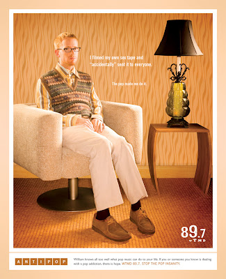


The similar visual style of each scene and the "Anti-Pop" theme provide cohesion across all three pieces. The brief copy blurbs each tell a different story but their font, placement, and length are uniform.


These ads have been around for a few years, and although the richness of the color always draws my eye, I've never really understood the concept. I always assumed there was just something I didn't understand about it, but now I'm pretty sure it simply doesn't make much sense. I get that it's supposed to mirror the "My Anti-Drug" PSAs ... but I don't follow the vintage/retro scene-setting. The images aren't pop, nor do they really represent WTMD's voice or audience (anti-pop). The copy works, but to me, the visual theme creates some conflict.
I tracked down the brief from the agency that worked on this campaign. It doesn't really help clarify things either:
Think pop music is harmless? Don’t be fooled, friend. Pop music can make you do things you wouldn’t normally do, act in ways you wouldn’t normally act, wear things you wouldn’t normally wear. It gets under your skin and before you know it, you’re a superficial shell of the person you once were.AntiPop is Planit’s “public service” campaign designed to bring "real life" pop music tragedies to the surface for all the world to see. AntiPop is a sobering reminder of what thin, shallow, cookie-cutter pop music can do to perfectly normal people.
So is it a cohesive campaign? Absolutely. Is it a good campaign? Ehh...
Friday, October 8, 2010
Point of Conception (Show and Tell)
I grabbed the low hanging fruit this week and decided to raid the archive at work for an example of concept. I did, at least, have this specific piece in mind when I set out on my search. So it's not like I simply took a haphazard tumble through some old boxes at 4 p.m. on a Friday, desperately searching for anything. Rather, I took a haphazard tumble through some old boxes at 4 p.m. on a Friday, desperately searching for something.
In any event, I did find what I was looking for. It's an appeal for our annual giving campaign. Annual giving traditionally sees smaller donations, and our development office wanted to stress the importance of gifts at any size. So, the tagline is "The biggest gifts come in small packages," and the inside features photos of staff, faculty, and alumni babies doing all manner of cute shit. The copy is a narrative about parents helping children grow, just as donors can help the university grow. It's all quite clever and well designed.
By the way, I'd love to take credit for the concept on this one, but it's all the work of a designer and my former boss. This was conceived (get it?) four years ago while I was still pretty new to the shop. But hey, at least I got to help proofread it. (Thrilling.)
Cover and inside page:


Thursday, September 30, 2010
Definitely maybe (Show and Tell)
It's already Thursday. Time to get it in gear and post last week's show and tell. For this assignment I picked two examples of definition: one visual, one verbal.

The visual piece is a recent Classic ad (above, left). It's a really simple idea that communicates extremely well. The shape of the container is instantly recognizable as a sauce jar, and inside are the whole ingredients that Classico wants its audience to recognize. (Notably absent is the huge shaker of salt -- but this isn't the place to start railing against the American sodium addiction.)
The second piece takes the opposite approach. Rather than defining the product in images, this ad for a Chevy Traverse defines (above, right) the product in four words: "Neither mini nor van." What does that tell the audience? On its face, the message shows us that this vehicle isn't small and it's not a van. But since there's a comparison to a minivan, it implies that this vehicle is in a competing class. It says, "Hey, in the market for a family van? Check this out crossover because it's better than a minivan. Maybe it's bigger. Maybe it's cooler. You'd better look into it."
Monday, September 20, 2010
Will Write 4 Food (Show and Tell)
I know a guy who hunts for wild mushrooms. He even offered to take me with him once, which is apparently a huge gesture of respect and trust among mushroom pickers because the location of a man's 'shroomin grounds is a closely kept secret. But then he told me I'd have to wear a blindfold until we reached his sacred spot in a remote forest -- the prospect of which, quite frankly, gave me the willies.
I never did find out if he was kidding about the blindfold. While I'm about 99% sure he was a legitimate mushroom hunter and probably wasn't planning the perfect murder, I didn't push my luck. My vague interest in tromping around in the dirt for an afternoon was far outweighed by my extreme interest in not spending eternity there.
Maybe that's in part why I was drawn to this Bon Appetit article as my example of good food writing. Chalk it up to curiosity fulfilled, but the piece peels back the blindfold (so to speak) on mushroom hunting -- an activity that most people know exists, but few ever take part in.
When I think of food writing, I generally think of an analysis of an ingredient, a review of a restaurant or a description of a meal. But this article is a telling of an experience, and an obscure one at that. It's entertaining and unexpected.
This story even gave me a creative lead on my concept for our first project, by demonstrating food writing doesn't have to be simply a recipe or a nutrition table.

Subscribe to:
Posts (Atom)